"
Plan your projects. Draw some sketches, think about how to realize your ideas, think about the materials you will use. Don't buy anything if you haven't got a clear idea about what you need and how you will assemble it." -
Dad
This is an advice my dad gave me a long time ago. He has been working as an engineer for the last 30 years, so I figure he knows what he's talking about. He also told me that the planning and designing process takes far longer than the actual construction and that the planning process is not limited to the actual construction, but involves ressource planning as well.
With that in mind, I fired up
Google Sketchup and started turning
my sketches into solid, measurable 3D models for resource planning (e.g. knowing how much of what sort of stuff to buy).

"
Plane deine Projekte durch. Skizzier deine Ideen und überleg dir, wie du sie umsetzen und was du für Materialien brauchen wirst. Kauf die Teile erst, wenn du eine genaue Vorstellung davon hast, was du brauchst und wie du es verwenden wirst." -
DadDiesen Ratschlag erhielt ich vor langer Zeit von meinem Dad, als ich ihn fragte, wie man ein Bastelprojekt am besten plant. Mein Vater arbeitet seit über 30 Jahren als Maschinenbauingenieur, hat aber vor seinem Studium noch eine Lehre als Maschinenschlosser gemacht, er dürfte mit seiner praktischen und theoretisch Ausbildung also wissen, wovon er redet. Er erzählte mir außerdem, dass der Planungs- und Designprozess sich nicht nur auf die Konstruktion selbst beschränkt, sondern auch Ressourcenplanung mit einbezieht, will heißen, wo krieg ich mein Baumaterial her.
Mit diesen Gedanken im Hinterkopf machte ich mich schließlich daran,
meine Skizzen in
Google Sketchup in vollwertige 3D-Modelle umzusetzen.
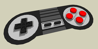
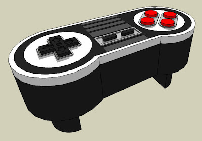
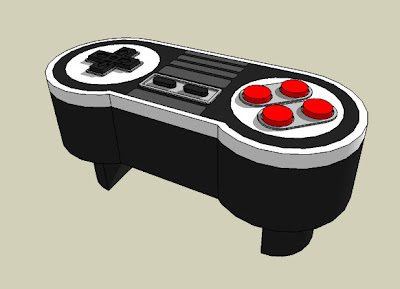
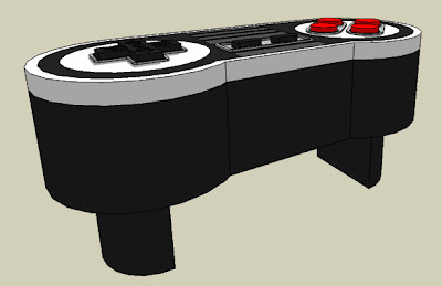
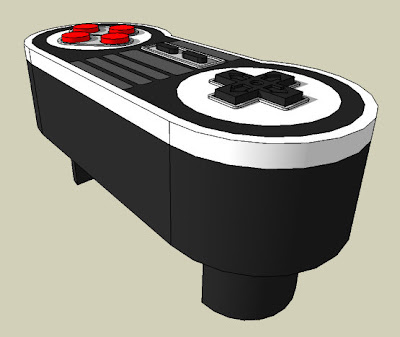
The first image is derived from my
final controller sketch. I left out the SNES logo as well as the "
Nintendo" and the "
Start" and "
Select" writings for simplicity reasons. I also decided to keep the design closer to the shape of the original SNES controller (actually painting the small lines surrounding the circles as I drawed them in the sketch would've been a huge pain in the butt).
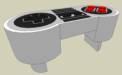
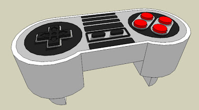
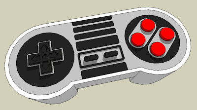
After that, I thought about inverting the color scheme, e.g. painting the dark areas in a bright color and vice versa. I toyed a bit around with that thought to get an idea how this would look like - the last three pictures show how it turned out.
Das erste Bild ist eine direkte Weiterentwicklung meiner
letzten Skizze. Um mir das Modellieren etwas einfacher zu machen, ließ ich sämtliche Schriftzüge (das SNES und Nintendo Logo sowie die "
Start" und "
Select" Beschriftungen) zunächst einmal weg. Ich entschied mich außerdem, mich stärker am Design des original SNES Controllers zu orientieren, da das Auftragen der dünnen Kreise (die ich in der Skizze um die großen Kreise links und rechts gezogen hatte) eine extremst mühselige Sache geworden wäre, die man leicht hätte versauen können.
Danach spielte ich mich dem Gedanken, das Farbschema zu invertieren, d.h. die dunklen Farbbereiche hell zu gestalten und die Hellen dunkel. Ich spielte ein bißchen mit dem Gedanken herum um eine Vorstellung davon zu kriegen, wie so etwas aussehen könnte - auf den obigen Bildern könnt ihr sehen, was dabei herauskam.